What Is Color Washing and How to Do It
Color washing is a painting technique that creates variation on a wall by layering a thin, semi-transparent glaze over a solid base coat. Instead of one flat color, you get slight shifts in tone that make the surface look more dimensional.
What color washing is
You start with a matte base coat. Once it’s fully dry, you apply a second color mixed with glaze so it goes on lightly rather than covering everything. The finish should look uneven in a controlled way; some areas slightly darker, others lighter. This is commonly used in Los Feliz luxury interior design to avoid flat, one-dimensional walls.
What it actually looks like on a wall
A good color wash doesn’t look like a pattern. You shouldn’t see clear brush marks or repeated shapes. Instead, the wall has a soft variation in tone, almost like two similar colors layered loosely over each other. In projects by a luxury interior designer Beverly Hills, the contrast is usually low so the effect stays subtle.
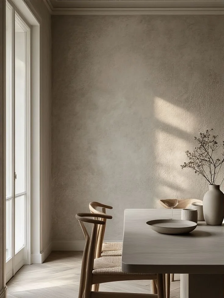
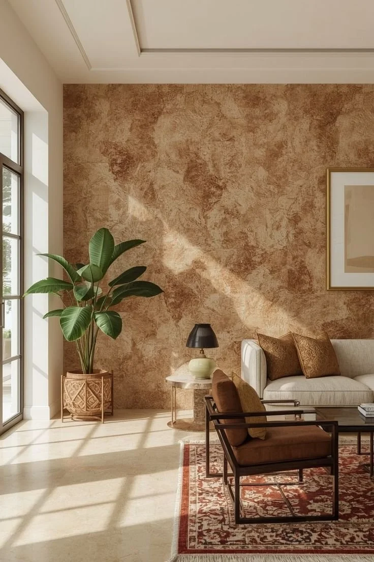
Photo Via: Decor Crowd
Where it works best
Color washing works best on larger, uninterrupted walls where the variation has room to show. It’s effective in dining rooms, bedrooms, and entryways. In older homes, especially those handled by a Hancock Park interior designer historic homes, it pairs well with original moldings and plaster walls because it doesn’t feel too flat or new.
How to do it step by step
Start with a fully dry base coat in a matte finish. Mix your glaze with paint at about a 4:1 ratio (glaze to paint) so it stays translucent. Use a wide brush to apply the glaze in loose, crisscross strokes across a small section (about 3x3 feet). Before it dries, go over it lightly with a damp rag to soften harsh lines. Move section by section and slightly overlap edges so there are no visible breaks. In many Studio City luxury home interiors, the effect is built slowly, one light layer at a time.
Photo Via: Apartment Therapy
Mistakes that make it look messy
High contrast between your base and glaze colors creates a harsh, patchy look. Applying too much glaze at once makes the wall look heavy instead of varied. Letting sections dry before blending leads to visible edges. A Sherman Oaks high-end interior designer would keep the colors close in tone and the application light so the finish looks controlled rather than random.