Rattan, but Classy: How Rattan Accentuates a Space
Good rattan reads airy and intentional. Bad rattan reads orange, glossy, and flimsy—and it can drag the whole room down with it. That’s why people swear they “hate rattan,” when what they really hate is cheap rattan.
Used well, rattan is a top-tier option on the list of natural materials to incorporate into your home. It lightens heavy spaces (stone, plaster, oak, even microcement) and adds texture without making things busy. Here’s how to choose it, place it, and pair it so it looks expensive.
How to Make Rattan Look Expensive
go bigger, not busier
Go larger than you think. One substantial rattan piece will always look better than a bunch of small ones. A real chair, a dining set, or a cabinet front feels intentional. Little baskets read like clutter.
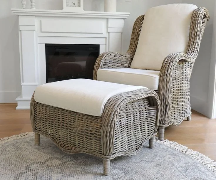
Photo Via: French Knot
pick the right tone
Skip anything glossy or honey-colored. Look for muted, smoked, or washed finishes with a matte feel. This matters even more in warm modern interior design LA, where the palette is usually quiet and tonal.
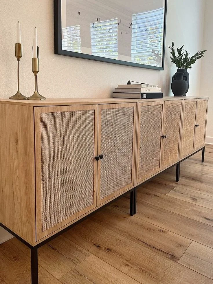
Photo Via: My 100 Year Old Home
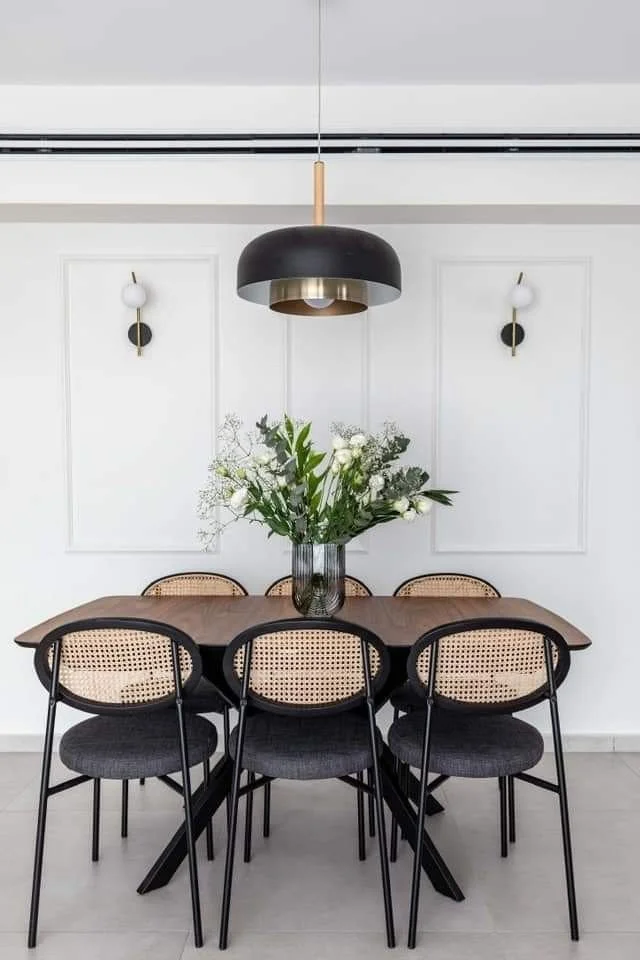
PAIR IT WITH MATERIALS THAT HAVE WEIGHT
Rattan looks more elevated next to clean, weighty materials like plaster, travertine, white oak, matte black metal. That mix is a staple of organic modern interior design LA because it feels natural but still structured.
USE IT WHERE YOU WANT LIGHTNESS
Try rattan in places where solid wood can feel too dense: dining chairs, an entry seat, or cabinet fronts. In European-inspired interiors Los Angeles, it’s usually the one textured note against plaster walls, oak, stone, and tailored upholstery.
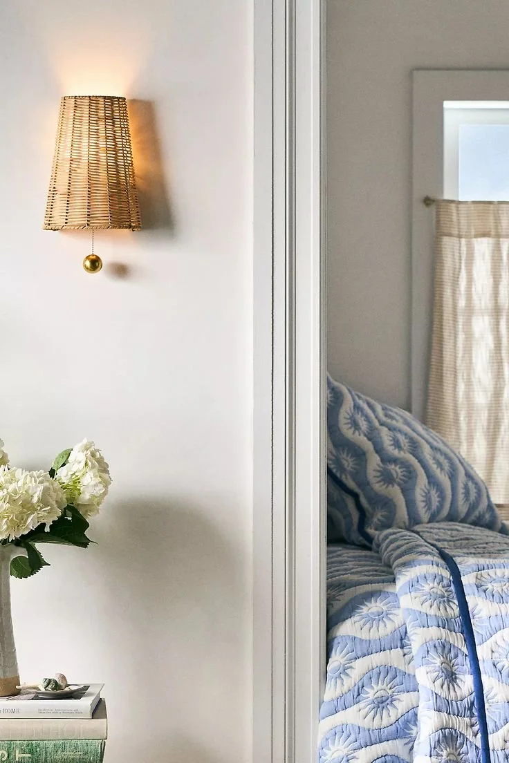
Photo Via: Anthropologie
If you want rattan to look expensive, stop treating it like décor. Buy fewer pieces, buy better ones.