Best Colors for Kids' Rooms
Color is usually the first thing people overthink in a kids’ room and the last thing they test properly. In Los Angeles light, the wrong “soft neutral” can turn chalky, pink, or unexpectedly gray by 3pm. And once the room is filled with books, toys, and art, a color that looked pretty or safe on a tiny swatch can start feeling underwhelming or overstimulating.
That’s why it helps to treat a kids’ room like the rest of the house: choose a low-contrast base with the right undertone, then bring personality through rugs, textiles, and art you can swap as they grow. That layered, natural look is exactly what California contemporary interior design does well, and it holds up beautifully in family homes.
the best kids’ room colors for playtime, focus, sleep, and an elevated feel
Soft warm whites + creams
Choose a warm white with a beige or peach undertone. It keeps the room bright without going sterile, and it works well with oak, linen, and woven textures. This is a go-to base in California contemporary interior design, especially when the rest of the home leans warm and natural.
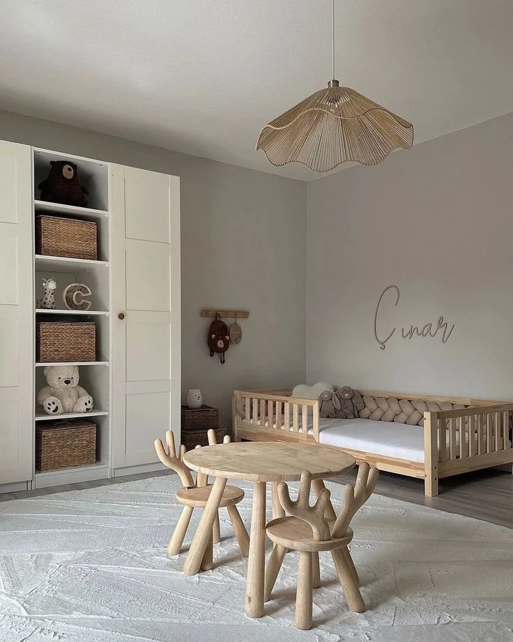
Photo Via: 2B Wood
Muted blues + blue-greens
Dusty blue, slate-blue, and soft blue-green make a room feel more settled, especially at night. Pair them with creamy textiles, natural wood, and warm metals so the palette doesn’t skew cold. You’ll see this a lot in warm modern interior design LA homes because it feels soft, but not themed.
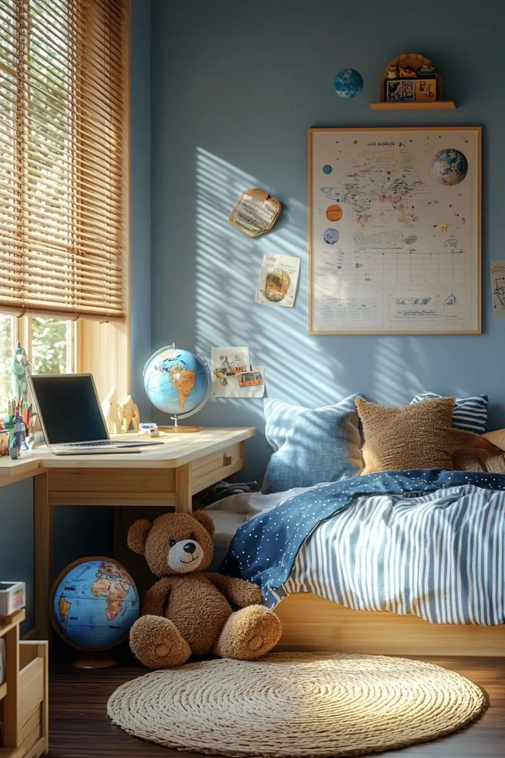
Photo Via: Daily Home Safety
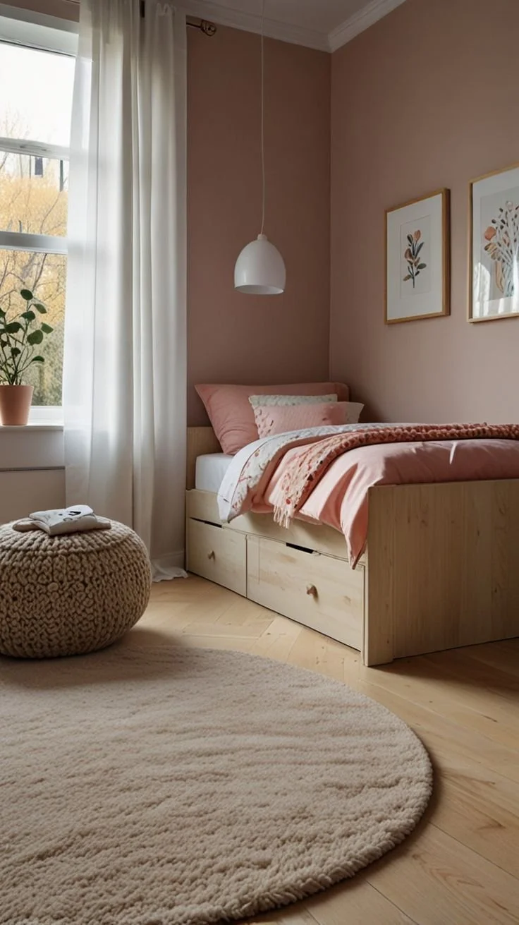
Dusty blush + clay tones
Think clay-beige, blush-tan, or a soft terra-cotta wash. These tones bring warmth without reading babyish, and they look elevated with creamy rugs, pale woods, and layered neutrals. They fit naturally in organic modern interior design Los Angeles, where warmth comes from materials, not bright color.
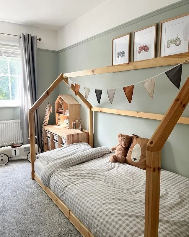
SAGE + OLIVE GREENS
Sage is one of the easiest colors to live with in a kids’ room. It absorbs visual noise from toys and art, and it still looks sophisticated years later. Keep it muted and pair with warm whites, oak, and natural-fiber rugs for a minimalist luxury home design feel.
BuTter yellow or ochre accents
Use this as a small accent, not a whole-room color. It works best in a linen lamp shade, a single art piece, a pillow, or a subtle stripe, especially with blue-green or sage walls. Keep it buttery or dusty. Bright primary yellow takes over fast.
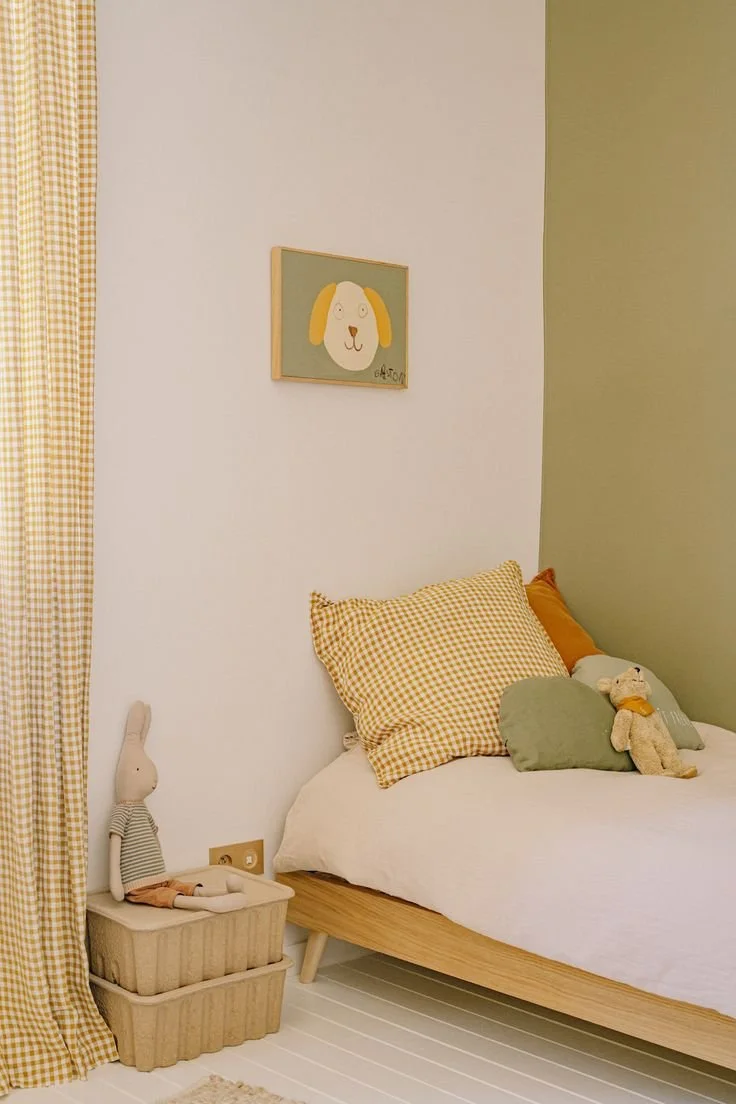
Photo Via: Home Magazine France
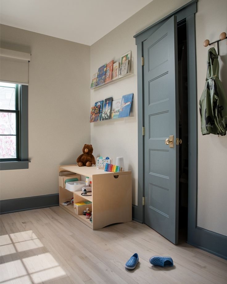
Charcoal or navy accents
This is for structure. Use it on a door, a built-in niche, or a simple color-block, then keep the rest of the room light and warm. This kind of contrast shows up across Los Angeles luxury home design trends because it looks tailored without feeling heavy.
Before you commit to any color, tape up swatches and live with them for a day. Los Angeles daylight exposes undertones fast. Start with a restrained wall color in eggshell, then let your kids' personality come from textiles and art you can switch out as they grow. That’s how a kids’ room stays elevated without turning into a constant repaint project.